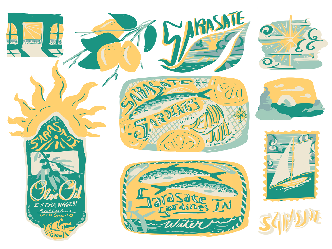
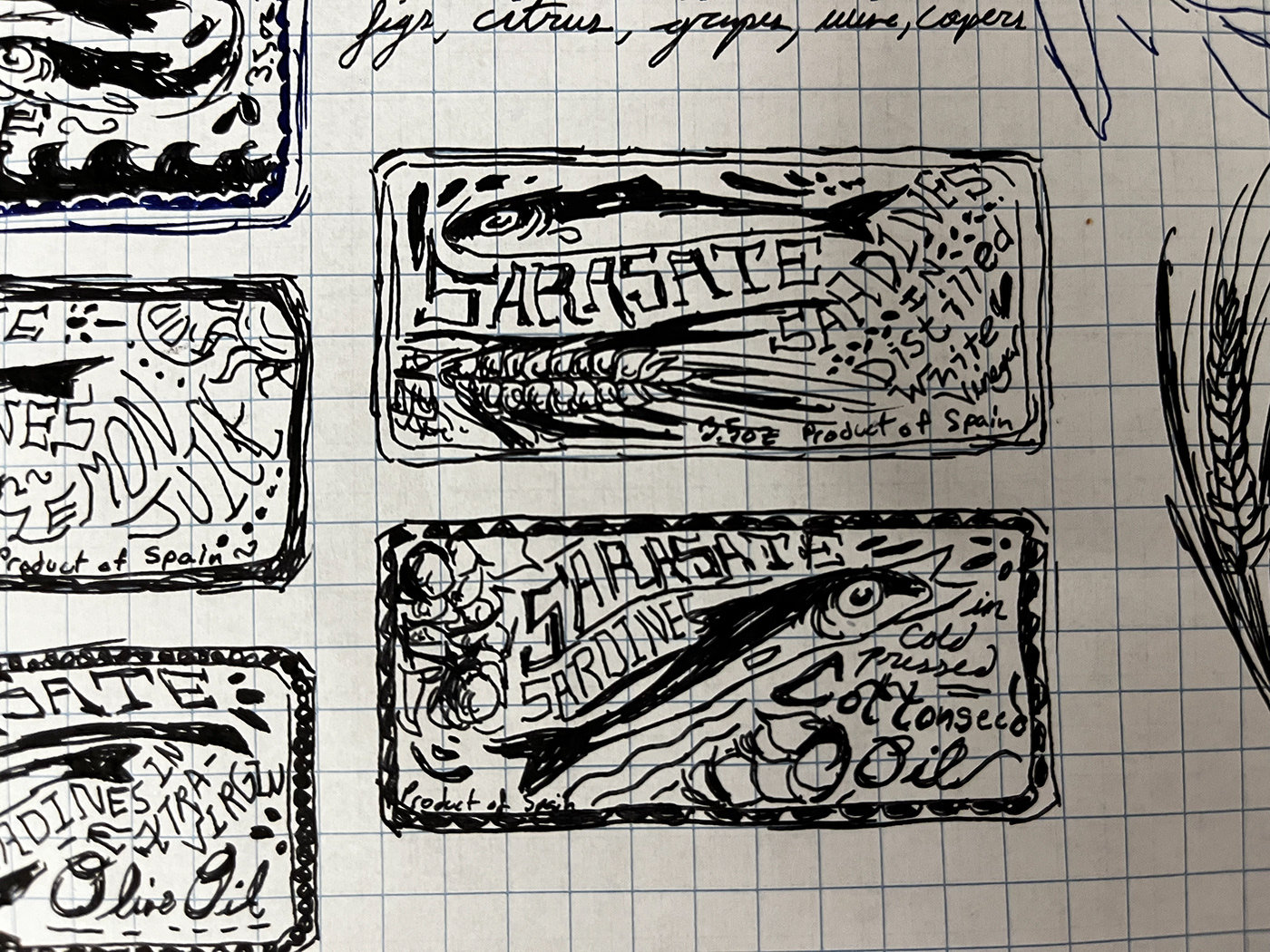

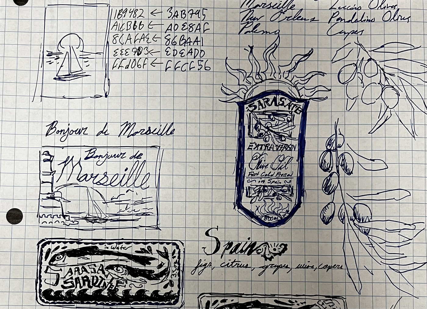
For this assignment, I was given a color palette and was only allowed to make something with the five colors I was given. My colors were ffd06f, eee7d3, 1b9482, 8cafea, and a1cbbb. My first thought was that these colors reminded me of the Mediterranean, so I chose to come up with a few designs that had to do with that region. The pastel yellow and blues felt rustic, so I had the idea of designing an olive oil label. Five colors didn't feel like it gave me quite enough contrast and variation to achieve what I had envisioned because the main colors were the darker blue and the yellow and it was difficult keeping them from clashing too much, so I did some doodling and came up with the idea to design a sardine can. I named the brand 'Sarasate Sardines' because the alliteration at the beginning of the words rolls off the tongue nicely, and because Sarasate is one of my favorite Spanish composers and his name objectively sounds cool. The 'S' sound is also why I included a sun in the label for the olive oil and I made the rays squiggly to imply an 'S' shape so it all came together. I was originally going to do a postcard for a city like Marseille or La Rochelle because I wanted to draw a sailboat on the ocean in front of the sun, but the colors I was given didn't allow any words to stand out against the sails of the boat since I would have had to use the light yellow for both, and my eyes kept being drawn to the images more than the words. I would like to note that the sailboat I drew is heavily referenced from a stamp I found on Pinterest, but everything else is loosely based on various food labels, prints, and postcards.


